The logo colors of real estate
Harness the power of color to build your brand

by Pinch Studio
A great foundation for building a brand
It’s a buyer’s market when it comes to hiring a real estate professional. Competition is fierce. Clients want to know that you’re capable of helping them reach their goals while being responsible with their time and money. Plus, they want to like you. So to make the sale you need to appear trustworthy, knowledgeable and personable.
So what are the keys to appearing trustworthy while also standing out in the crowded real estate market? We’ve analyzed the color palettes of over 600 real estate industry logos, evaluated the brand personality traits that realtors want, and consulted color psychology experts in order to help you decide.
Making the appraisal: how real estate colors add up
-
 All data visualizations designed by MH Designs.
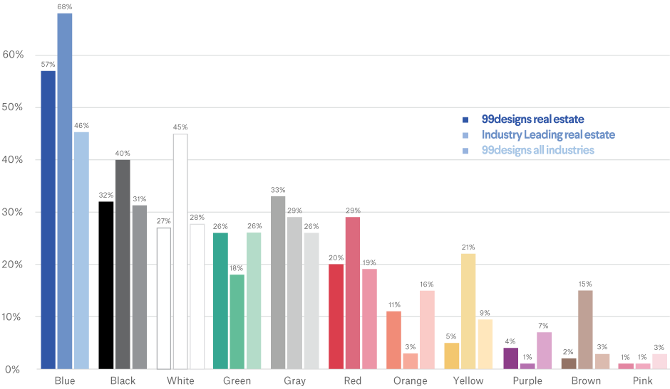
Real estate professionals are a colorful bunch. Like many other industries, however, there is a preference for blue: over two-thirds of industry-leading logos feature blue, with the color being requested in over 50% of real estate logo design contests at 99designs. But other colors make a strong showing: green, for example, is requested about 26% of the time in briefs for real estate contests, and red appears in roughly a third (about 29%) of real estate industry leaders' logos. Gray, black and white are also popular as easy companions to any color.
Pinks, on the other hand, appear in less than 2% of all real estate logos, ranking last as an color choice in the industry. Perhaps its softness makes it seem out of place, or maybe its youthfulness and trendiness subtract from the relatively conservative and trustworthy image that can be so important in making sales within the industry.
Logos from the four most recognizable real estate brands illustrate these preferences:
Logos from the four most recognizable real estate brands illustrate these preferences:
Blue appears in three of these logos, and is the prominent color in two—though the specific shades communicate different attributes. While Coldwell Banker’s dark choice is dignified and authoritative in navy, Prudential’s lighter, more buoyant blue translates as more calming and approachable.
Century 21, arguably the most recognizable brand of them all, reminds us that blue is not the only powerhouse on the block. Paired with a strong black text, yellow stands out and gives the house a positive, vibrant, welcoming vibe. Note that while Century 21 continues to provide this classic logo in their official brand asset resources, they have also started using a modernized word mark on their website in a slightly more luxurious metallic brass, shying away from their recognizable font choice and treatment. All of that said, these distinctive colors help Century 21 stand out in a predominantly blue neighborhood.
The colors you select for your logo can have a subtle yet profound effect on how clients view your brand, just as is the case with these companies. So, how can a smaller business emulate the success of trendsetting industry leaders without the multi-million dollar marketing budget?
Once you know what you want your brand personality to be, it’s easy to translate those traits into colors.
On the market: colors of brand personality in real estate
Start determining your brand personality by asking yourself these six questions:
- Gender: Is my brand traditionally masculine or feminine?
- Tone: Is my brand playful or serious?
- Value: Is my brand luxurious or affordable?
- Time: Is my brand modern or classic?
- Age: Is my brand youthful or mature?
- Energy: Is my brand loud or subdued?
We'll use your answers to see what logo color works best for you.
Here's how real estate businesses on 99designs define their brand personalities:
-
We analyzed the preferences of all industries and assumed normal distribution. Preference strength was figured on number of standard deviations from the mean.

From this we infer that people in real estate want to be perceived as luxurious, mature, modern and serious. These traits align with the following colors:
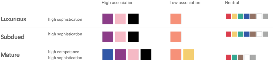
Based on this, we would expect to see a lot of blue, black, purple and pink real estate logos, and very few that are orange and yellow.
In reality, we do see a propensity towards blue and black. Many real estate agents have relationships with larger brokerages (like Sotheby’s or RE/MAX), which could explain why we see a trend towards certain colors. Similarly, no large brokerage is using pink or purple in their branding, and this could explain the slightly more “classic” choices within the industry. But hey, nothing lasts forever—as entrepreneurs continue to disrupt industries, we’re starting to expect the unexpected—youthful, high energy colors may suddenly come into vogue.
A quick look at these three logos from 99designs reinforces the popularity of subdued, mature tones like blue, black and dark grey for real estate logos. The use of gold and crisp white accents lends a sense of luxury sense to these boutique real estate brands.
A quick look at these three logos from 99designs reinforces the popularity of subdued, mature tones like blue, black and dark grey for real estate logos. The use of gold and crisp white accents lends a sense of luxury sense to these boutique real estate brands.
-
Logo design for Goldpoint Properties by Kelly Norman
-
Logo design for Willis Property Company by Bion
-
Logo design for Wuhrlin Real Estate by allyna


Warm colors can give a logo a friendly injection of warmth and personality, which is why orange and yellow – despite ranking pretty low on popularity within the industry – are strong choices for accent colors.
Increasing your curb appeal: what colors should realtors consider?
If you’re willing to stray from the tried-and-true blue of real estate logo colors, there are several other options that can help you stand out visually while maintaining a brand personality that’s trustworthy and competent.
Both pink and purple are perceived as luxurious and mature, yet appear in less than 6% of all real estate industry logos (and just 3% of the industry-leading logos). Just because they’re not necessarily statistically popular does not mean that they are off limits. If you specialize in higher-end property, elevate your brand with the royalty of purple. Alternatively, if you are a buyers agent specializing in first timers or a more youthful clientèle, disrupt the norm with a softer, modern pink.
The unique value that only you can offer is your relationship with buyers and sellers. If you’re working for yourself, your brand personality will be highly influenced by your own personality.
Focus on how you can help clients reach their goals better than anyone else, and employ color to bring in elements of your unique charm. You could also follow in the footsteps of industry leaders who have chosen to play up other brand personality traits in their logo color choices.
-
With thousands of employees in over 67 countries, Colliers International shows its diversity by building on blue with bright hues. Multiple colors also allude to the company’s range of services to commercial real estate owners, investors and developers.
-
Cushman and Wakefield’s bright red logo is associated with strength and determination—suite traits for a global company that’s all about helping clients transform the way people work, shop and live.
-
Newmark Knight Frank is one of the world’s largest commercial real estate service firms, proving that pink is indeed capable of building an empire. This vibrant shade possesses the same high energy as red; it’s passionate without being overly aggressive.
As you seek to design your real estate logo, you’ll want to take your brand personality into account, and think about the traits you most want to convey. Color is a personal choice, but understanding color psychology in marketing can help you make an informed decision for your small business.
Have we confirmed your choice for blue? Or made you passionate about purple? Either way, when you work with a designer on your logo, remember to focus on what separates you from other real estate professionals in your market.
Blue collar, white collar, purple collar: what are the logo colors of other industries?
Get a real estate logo design now!
Want to know more about how design impacts business?
Subscribe and be inspired by our best tips, trends and resources.
We'll also send you the occasional marketing email and promotion (which you can opt-out of anytime).