The logo colors of agriculture
Harness the psychology of color to build your brand.

by Pinch Studio
Agriculture branding: colors for a growing industry
People think they need a new iPhone or those designer boots… They need it until they get hungry, then all they need is some food. In terms of satisfying consumer needs, the agriculture industry — which provides both food and materials for clothing — has all others beat. But when it comes to agriculture branding, color choice is a mixed bag.
On the one hand, agriculture colors have traditionally represented the old-fashioned principles the industry is known for: hard work, family values, rustic lifestyle, etc. On the other hand, the modern agriculture industry takes advantage of sophisticated technologies like robotics, thermal & moisture sensors, and increasingly environment-friendly fertilizers and pesticides. The question is, how do you brand a modernized industry that retains traditional values without leaning too far in one direction?
On the one hand, agriculture colors have traditionally represented the old-fashioned principles the industry is known for: hard work, family values, rustic lifestyle, etc. On the other hand, the modern agriculture industry takes advantage of sophisticated technologies like robotics, thermal & moisture sensors, and increasingly environment-friendly fertilizers and pesticides. The question is, how do you brand a modernized industry that retains traditional values without leaning too far in one direction?
We went through over 200 agricultural logos and brand identity packages from our 99designs backlogs and analyzed their color palettes. We then cross-referenced what we found with the brand personality traits the business owners stated in each design brief, and had our color psychology experts weigh in. The results are all below, to give you the background you need to make an informed and reliable decision about your company’s agriculture branding.
It’s easy being green: digging into agricultural colors
-
 All data visualizations designed by MH Designs.

Clearly, almost obviously, green dominates both the agriculture logos of the industry leaders (60%) as well as our own 99designs contest data (64%). The top pairing colors, on a whole, are black, white and blue. Although they weren’t as prevalent in 99design contests, red, yellow and brown frequently appeared in the branding color palettes of industry leaders.
Which colors aren’t sprouting? Purple and pink are mostly absent in agricultural branding, likely because they oppose the hard-working and rugged persona of the industry. (Purple is the color of royalty, a historical opponent of the farmer).
It’s worth noting that 80% of our agricultural entrepreneurs didn’t request a particular color when filling out their 99designs design brief. In other industries only 20-40% of clients don’t specify a color, so for whatever reason, farmers are more likely to leave color decisions up to the designer.
Agriculture branding in action: 4 fully-grown logos
Until we get a viable alternative for sustaining life, the food industry will continue to be a large market. Let’s take a look at how the leaders in the agriculture industry choose to present themselves.
Both Tyson and Ocean Spray use blue as the dominant color with a white accent for their corporate logos. This is typical of larger companies that appeal to the general public because blue and white are typically “safe” colors.
However, what’s interesting is that Tyson uses different logos for their corporation and for their food products. The red, yellow and white logo on their food products is a lot more attention-grabbing and energetic—better for attracting customers from a supermarket shelf—while the tranquil blue appeals more to investors and business prospects. This distinction perfectly illustrates the importance of considering business goals when choosing brand color schemes.
Ocean Spray, on the other hand, uses blue uniformly. Perhaps this is because the blue works best with the aquatic theme that ties together their logo image (a wave) and their very name combining two water-based words.
Compared to the first two, the logo for Annie’s seems to break form, just like the company itself does with its organic and natural products. Using only yellow would make this logo seem almost passive, let alone be hard to spot on product packaging, so the brand outlines it in a bold black. This complements the somewhat passive yellow with more strength, without turning aggressive. The purple accent keeps the brand quirky and unique.
Not all agriculture logos need to be so involved. Kellogg’s simple and timeless logo is also one of the most recognizable. The use of only red, one of the most dominant colors in the spectrum, is enough to keep the logo interesting and attract attention, despite it being only a wordmark. (That’s not to say the designers were slacking off: notice how the second L is slightly larger than the first, a strategic choice to make this “simple” logo look more aesthetic.)
Harvesting the right agriculture colors for your brand identity
Start determining your brand personality by asking yourself these six questions:
- Gender: Is my brand traditionally masculine or feminine?
- Tone: Is my brand playful or serious?
- Value: Is my brand luxurious or affordable?
- Time: Is my brand modern or classic?
- Age: Is my brand youthful or mature?
- Energy: Is my brand loud or subdued?
Here's how agriculture businesses on 99designs define their brand personalities:
-
We analyzed the preferences of all industries and assumed normal distribution. Preference strength was figured on number of standard deviations from the mean.

The clear winners are classical and economical, the most crucial traits for agriculture branding. Not surprisingly, this ties into the “old-fashioned” values we mentioned earlier. We asked our design experts about which colors represented these traits best, and here’s what they said:

The results create a divide between what should be true of agriculture branding and what’s actually true. Namely, green is technically a neutral color for the top agriculture branding traits, and yet it’s the most prevalent. One of the least prevalent colors, pink, is ironically the only color to suit both traits.
From this discrepancy, we can infer that there are stronger influences at play than conventional marketing wisdom. Color theory doesn’t account for the strong underlying associations of green (and brown to some extent) to nature, growth and freshness, all core components of any agriculture branding identity.
Black and white, representing classical and economical traits respectively, seem to be popular agricultural colors for different reasons. Disregarding their associations, these achromatic colors represent old-fashioned values (reminiscent of pre-color media), not to mention they look great when coupled with more vibrant accents, most commonly green. See what we mean in the example below.
McPherson Family Farms logo by GOOSEBUMPS.
McPherson Family Farms hits the family-oriented business approach hard with an old-fashioned logo. The white backdrop plays up the dominant green, with accents of brown and sky blue to create a “realistic” vision instead of a more abstract logo. The dominant green and brown — in addition to the old-fashioned style and fonts — drum up the traditional values of farm life that the brand wants to represent them.
However, these standards may need to be varied depending on the business goals…
However, these standards may need to be varied depending on the business goals…
Columbia Farmers Market logo by DSKY.
The Columbia Farmers Market logo deviates from typical agriculture branding in that it utilizes the color red. This is because their marketing goals are slightly different than most farm brands. The Columbia Farmers Market logo is intended to attract attention for an event, not sell products, so the dominant use of attention-grabbing red makes more sense.
Cannabis logo colors: how marijuana simultaneously expands on and subverts agriculture branding
The latest sector of the agriculture industry is also one of the fastest growing. According to Forbes, consumer cannabis spending will increase more than 5x in the next decade, going from $9.2 billion in 2017 to an expected $47.3 billion in 2027. Here at 99designs we can vouch for that, as we’ve seen a 59% increase in cannabis design work since 2015. Because it’s a newcomer, the cannabis industry sees a lot of variety stylistically from designers; after all, there’s not much precedent to go on yet. But now that medicinal marijuana is legal in 29 U.S. states, the demand for cannabis logos is skyrocketing.
-
Logo design for House of Genetics by A3"
-
Logo design for Dr. Raw Organics by markomavric
-
Logo design for High Country Botanicals by pswizzard
Still, without much frame of reference, it's difficult at this stage to say outright what the best cannabis logo colors are. Cannabis branding is torn between either playing up or distancing itself from its rebellious identity of the 80s. Some brands are finding success using the “stoner cliches” like pot leafs and psychedelics, while other companies are bridging the gap to conservative markets with more formal and modern branding work.
What we can say for sure is that green tops the list of cannabis logo colors, and for good reasons. First, the cannabis industry is still part of the agriculture industry, so it shares the same marketing benefits from green as any other farm. Second, the color green has always had a direct connection marijuana: it’s the color of the plant itself, and has infiltrated the slang of pot-smoking culture.
As we mentioned above, there’s two main routes to go with branding and choosing your cannabis logo colors. If you’re targeting younger and more casual markets, a dominant green brings with it the more fun and adventurous connotations from marijuana’s past reputation. If you’re targeting older or more conservative markets, using another color as your primary with green as a secondary color helps you stand out from your competition and distances your brand from marijuana’s negative reputation.
Picking the best agriculture colors for you
Choosing branding colors is never black-and-white.
Each brand has their own identity and personality to match their business strategies, so even in an industry with well-defined standards, some companies could benefit from going against the norms.
The first step in choosing your brand colors — for the agriculture industry or otherwise — is defining your brand identity. Different colors represent different emotions, so much of the decision stems from the traits you’d like to represent yourself.
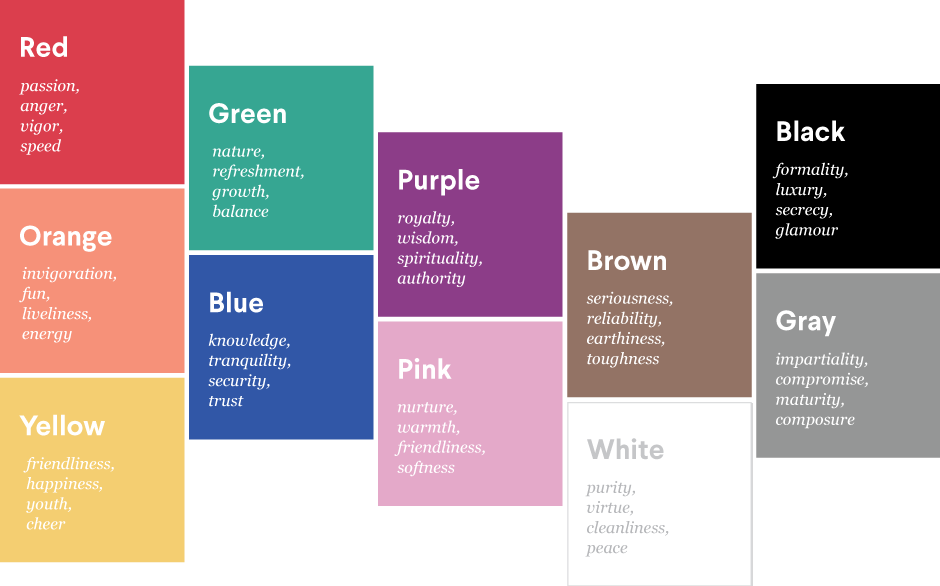
Looking at the chart, it’s clear why agriculture brands emphasizing “nature” or “refreshment” are choosing green as their primary colors. Even if you choose green, though, there’s still plenty of opportunities to set yourself apart. The secondary colors and accents are an opportunity to fine-tune your brand identity and make it your own. But each have their own connotations, even if slight.
Ironwood Organics logo by subtropica
For example, green with a white accent denotes a more classic brand...
...whereas green with a black accent seems more sophisticated and cutting edge.
However, the nuances of color theory go deeper than just reading off a chart. It’s about not only choosing the right colors, but also knowing how colors go together, how much of each color to use and where in the design to use it. For this reason, many business leaders simply hire a freelance designer to handle this. That way they benefit from the expertise of a professional instead of doing it themselves and hoping for the best.
Our Designer Search feature offers filters to let you find designers who specialize in a particular industry. From there, you just have to browse for a style that matches your brand.
Our Designer Search feature offers filters to let you find designers who specialize in a particular industry. From there, you just have to browse for a style that matches your brand.
Blue collar, white collar, purple collar: what are the logo colors of other industries?
Get an agriculture logo design now!
Want to know more about how design impacts business?
Subscribe and be inspired by our best tips, trends and resources.
We'll also send you the occasional marketing email and promotion (which you can opt-out of anytime).