Crown for WOOW!

1
Ontworpen op 99designs van Vista
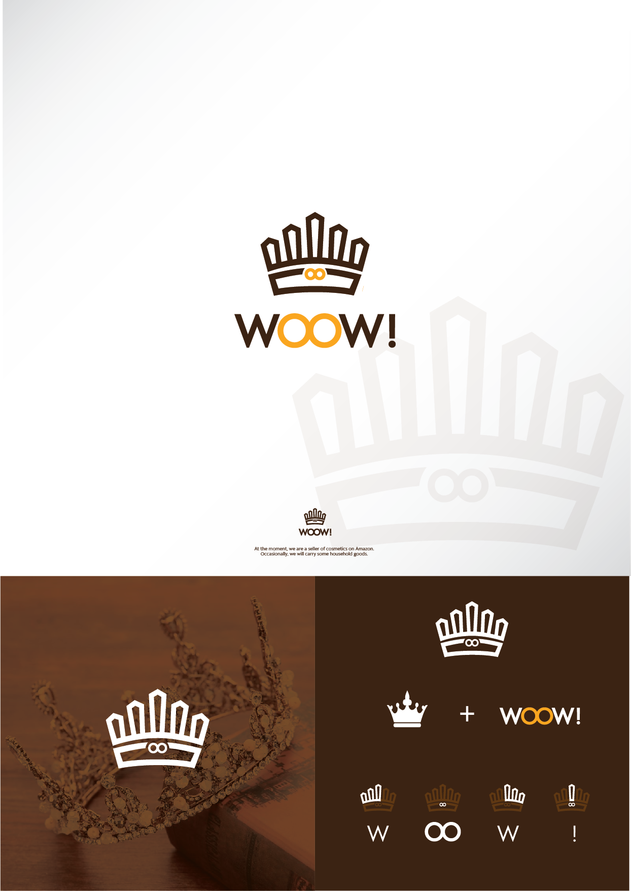
My concept is to put all the essence of this company in one simple minimalist logo. I make this logo with the crown shape, it represent the quality and honesty. I also make the double O in the WOOW! joint together in order to give the message of the customer connection with the WOOW! store. The color of brown and yellow will represent the happiness of the customer.