Gender Neutral Minimalistic Deodorant Label

0
Ontworpen op 99designs van Vista
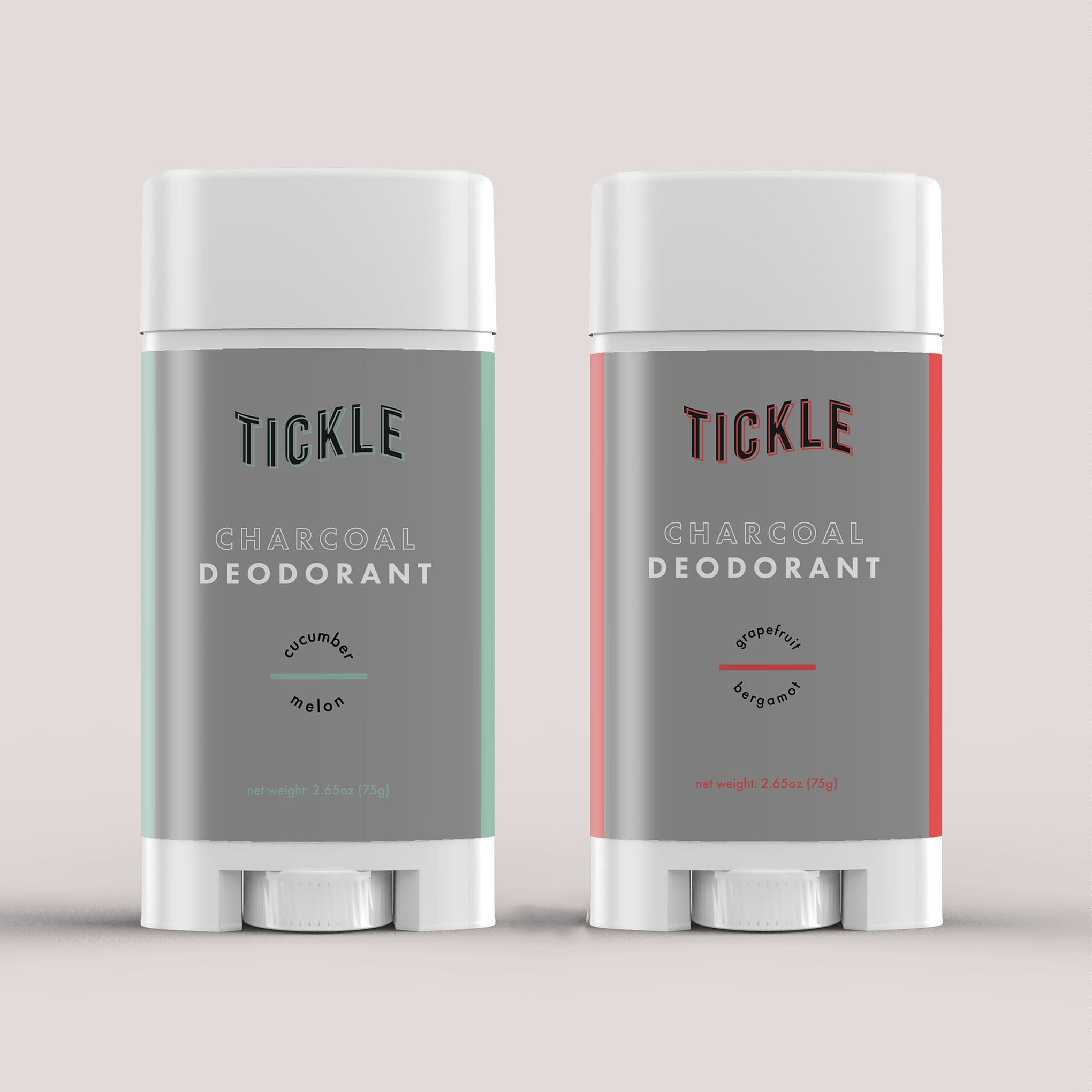
I wanted the label to be straightforward. So customers know what the product is in a blink. The colors reflect the scent so they are easily identifiable. I started by imagining myself in the deodorant aisle. My eyes normally quickly scan each row and the labels with a lot of words and too many graphics get overlooked. We don't have time to look at each brand or label so normally we drift to the packages or labels that are easy to understand, familiar and pleasing to the eye.