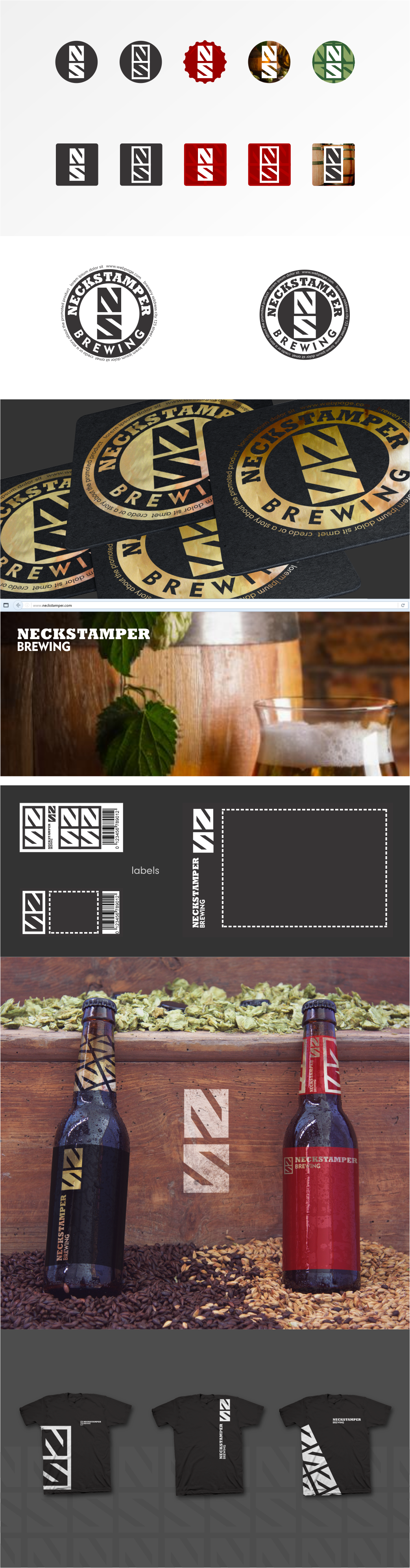

This design was one of the few finalists. Presentation to the client:
Small breweries are able to maneuver very quickly.When a target group is wide and fragmented, targeting individual fragments requires excellent adaptability.
You're going to need a logo that supports rather than interferes
with whatever design there is on the label. That's what my main idea is. It is not classic and it is not supposed to be a classic brewery-style logo.
- Circular logo given in positive and negative variation.
- Horizontal typography is shown as a part of a website.
- This logo allows for the maximum pace on any label shape.
There are variations of horizontal and vertical one. The bottle to the right shows that everything can be compressed into the top label, leaving the bottom one for the beer itself.
- Repeating logo gives a sensible ornament that can be used in numerous ways. Beer keg label can be easily distinguished using this pattern...