
Designer: Hizkya Izaak
Concept:
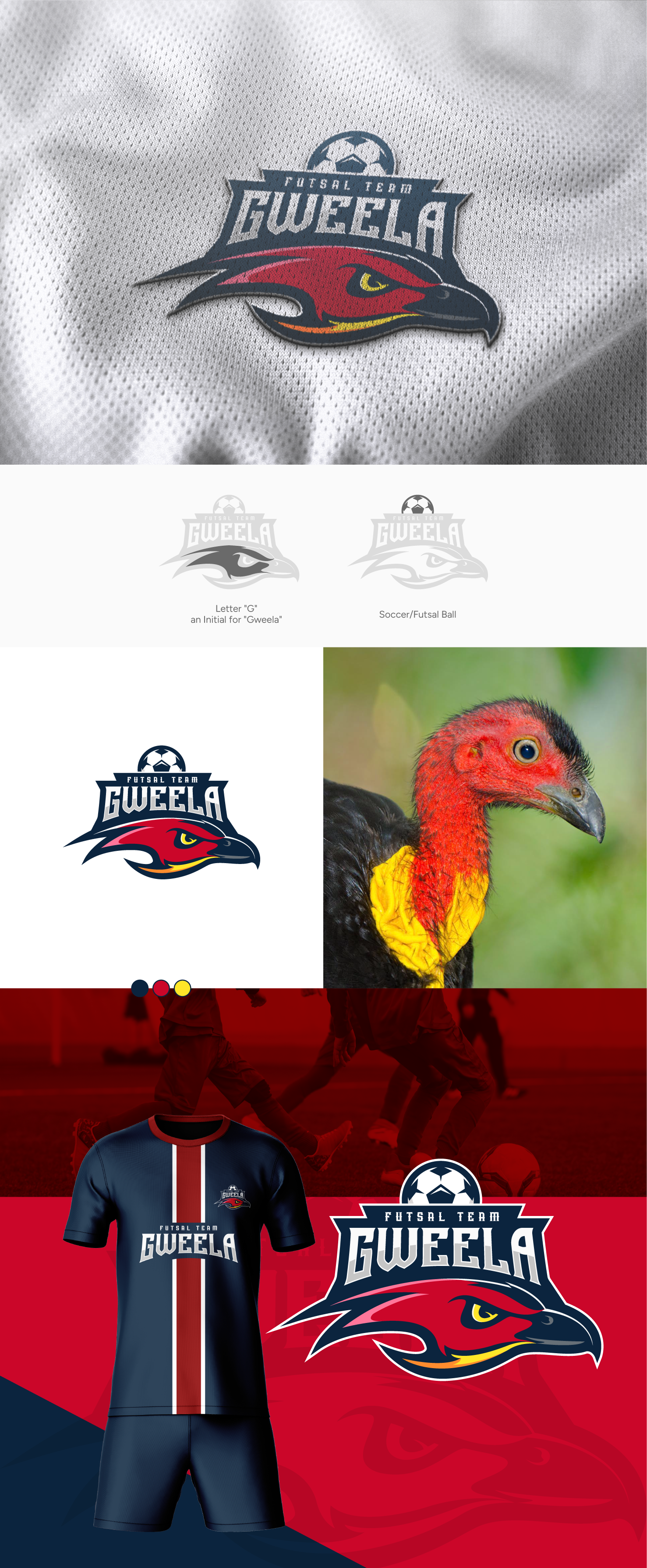
The Gweela Futsal Club logo takes cues from the scrub turkey, embodying strength, resilience, and agility. It reflects the team's determination, swift reflexes, and relentless drive in futsal.
Design:
A dynamic scrub turkey in motion is the focal point, its gaze mirroring Gweela's prowess. The vibrant #cb0629 hue highlights the "G" for Gweela, exuding energy.
Colors:
#cb0629, bold red for passion, complemented by #ffe629, vibrant yellow for optimism.
Typography:
Above the turkey, "Gweela Futsal Team" in bold font, showcasing authority and competitiveness.
Message:
The logo embodies the club: resilience, speed, unwavering drive. Like the scrub turkey, the team conquers the futsal court.
Versatility:
Designed for adaptability, the logo translates seamlessly, ensuring instant recognition.
Conclusion:
The Gweela Futsal Club logo mirrors players' traits, representing their journey to victory.