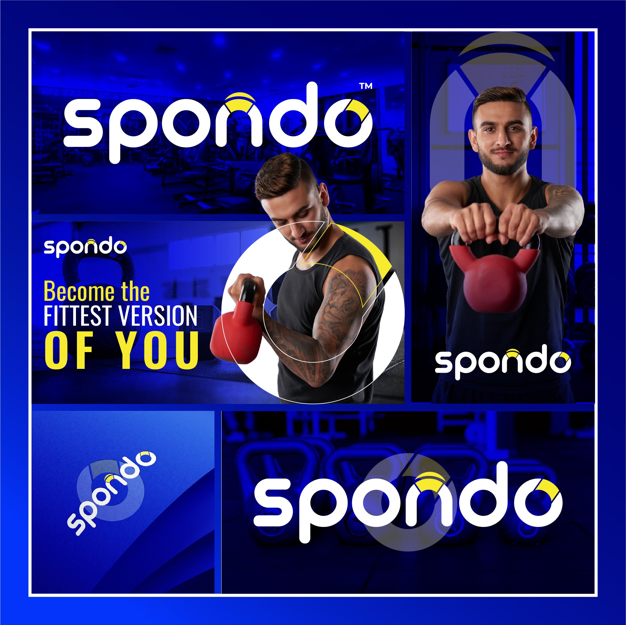

Meaning:
The rounded typography and dynamic layout convey inclusivity and energy, aligning with the brand’s focus on fitness and well-being. The yellow and blue palette reinforces positivity and trust.
Design Process:
I started by experimenting with modern fonts and rounded shapes to create an approachable and energetic logo. After refining the design, I tested it across digital and physical platforms for versatility.
Result:
The final logo is vibrant and engaging, perfectly suited for a fitness brand aiming to inspire and motivate its audience.