Georgian Wine House packaging logo design

1
Ontworpen op 99designs van Vista
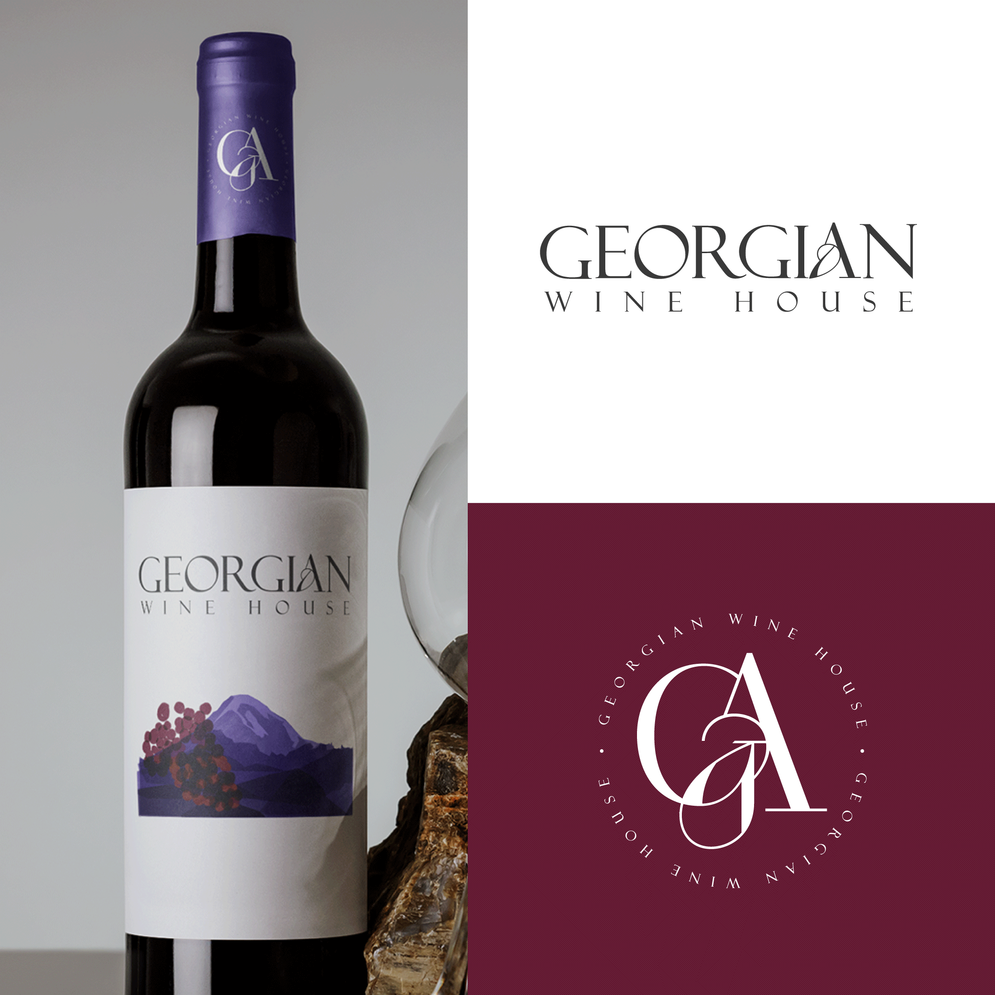
Mockup of a wine bottle on the left, showcasing the practical application of the logo. The label illustration is original, crafted by the designer, as a courtesy. On the right, there are two versions of the logo, both to be used at different moments – the upper one, on a white background, serves as the primary version, while the lower one is a simplified version featuring the letters (G for Georgia and A for georgA)