
What’s the first thing that comes to mind when you’re thinking about patterns? Ugly wallpaper or your grand-aunt’s curtains might pop into your head. But patterns are so much more than that—and they’re so on-trend right now that you just can’t escape them.
Patterns can be found all over corporate design, web design and packaging. And for good reason: they’re an amazing way to build and strengthen brand identity and style. Trust me, there’s a pattern out there for everyone.
In this article we’ll introduce you to the world of patterns: what they are and how they’re created, what types of patterns are out there and—last but not least—how you can find the perfect pattern for your brand. Let’s dive right in!
Things you need to know before you start designing your pattern
—
Basically, a pattern occurs when one or more symbols repeat themselves and fill a surface in a (more or less) structured way. This repetition can be regular or irregular. The effect of the pattern changes depending on which symbols are used and how they are repeated.

While patterns are really on trend right now, technically, they have been around for, well, forever. Often they occur naturally—think trees in a forest or sea shells on a beach. So it’s no surprise that throughout human existence people have been drawing and decorating their surroundings using patterns. We can find the first pattern designs in cave painting and trace them through history and cultures like a common thread. There’s no lack of examples in architecture, art and fashion.
And there’s a simple explanation why we feel so drawn towards patterns: by filling a canvas with symbols using a repetitive structure and spacing our brains recognize the repetition, which gives us a feeling of order. This harmonious order makes looking at patterns a pleasurable experience.
Using pattern design for your brand
—
Think about mood and style
If you want to find the right pattern design for your brand, it’s crucial to first understand who your audience is and what mood and style you want to convey. Patterns are a great tool for establishing a connection to a specific feeling by creating a coherent image without having to put it into words. But first, you’ll want to think about what mood it is you want your brand to represent—and how your pattern can help you with that.
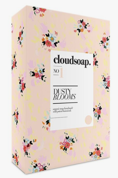
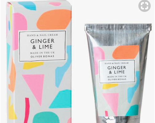
Let’s look at floral patterns. While this is a popular pattern choice, it doesn’t work for every brand. Imagine seeing a floral pattern on a lawyer’s business card—feels wrong somehow, doesn’t it?
However, if it’s a business card for a florist or a cosmetics packaging, it would fit perfectly. The reason is obvious: the flowers in the pattern represent a direct connection to the brand’s service or product.
Additionally, we instantly associate floral patterns with certain things—such as femininity, beauty or a sunny meadow—which is exactly the mood a brand would want to create when using thy type of pattern in connection with their product. If your client is craving beauty and harmony, there’s a good chance they will be drawn towards your product if the mood of the packaging conveys just that.
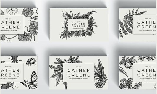
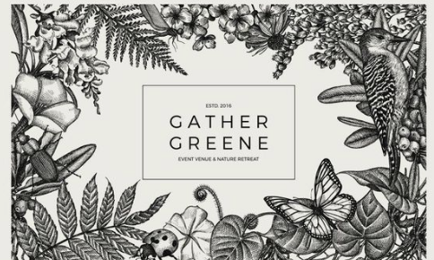
Incorporating your logo into your pattern
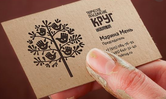
Your logo is the foundation of your brand identity. So if you want your logo to have even more impact, you should consider turning it into a pattern. Your logo itself (or a simplified variation of it) can act as the symbol that’s repeated in your pattern. By repeating the shape you can create a coherent connection to your brand across all kinds of brand materials, which will amp up your logo’s familiarity in the eyes of your audience.
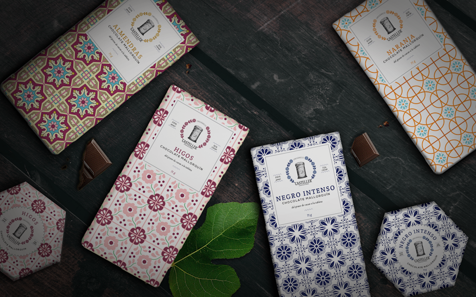
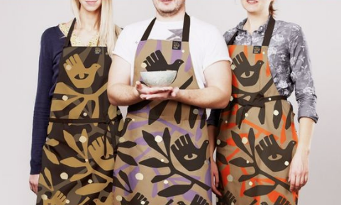
Using patterns to differentiate products
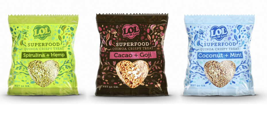
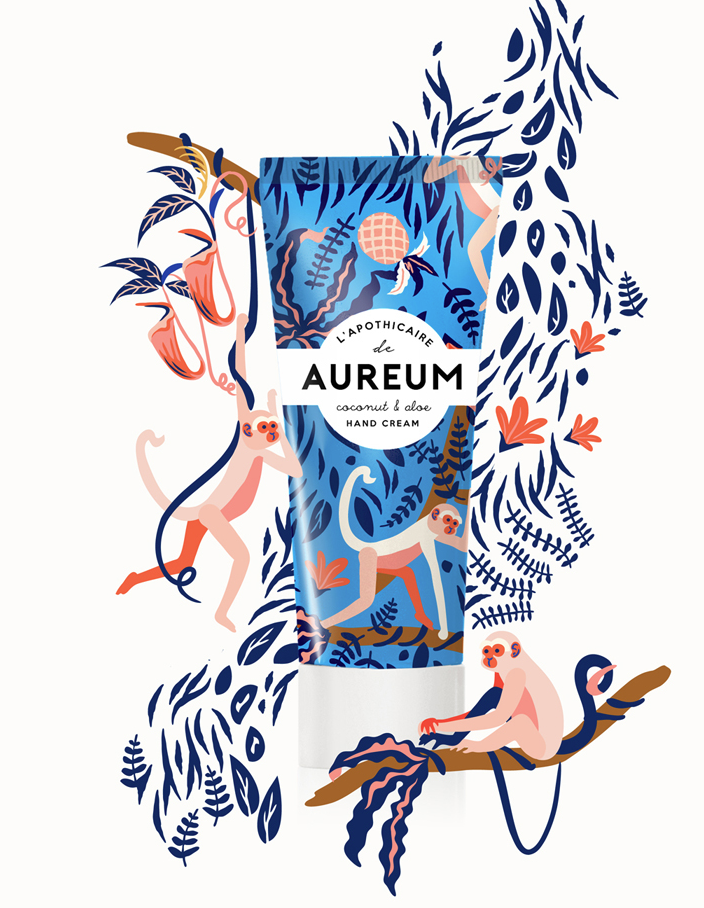
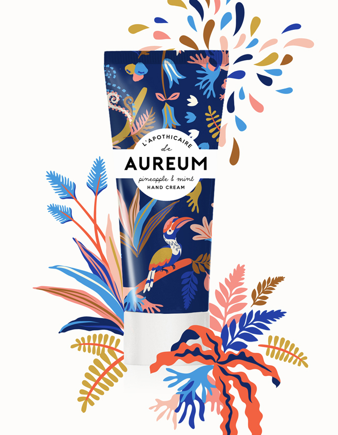
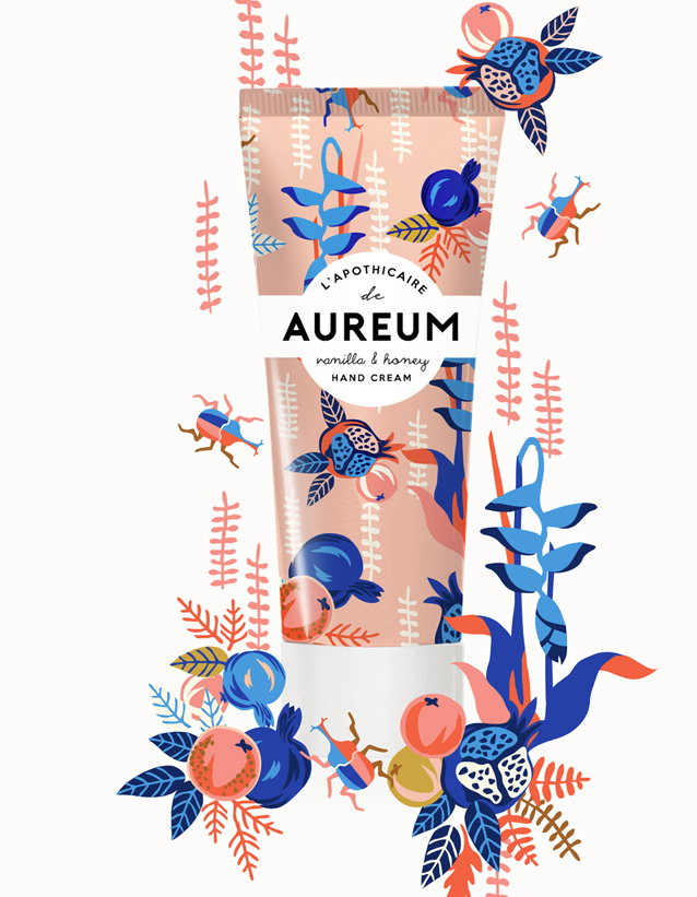
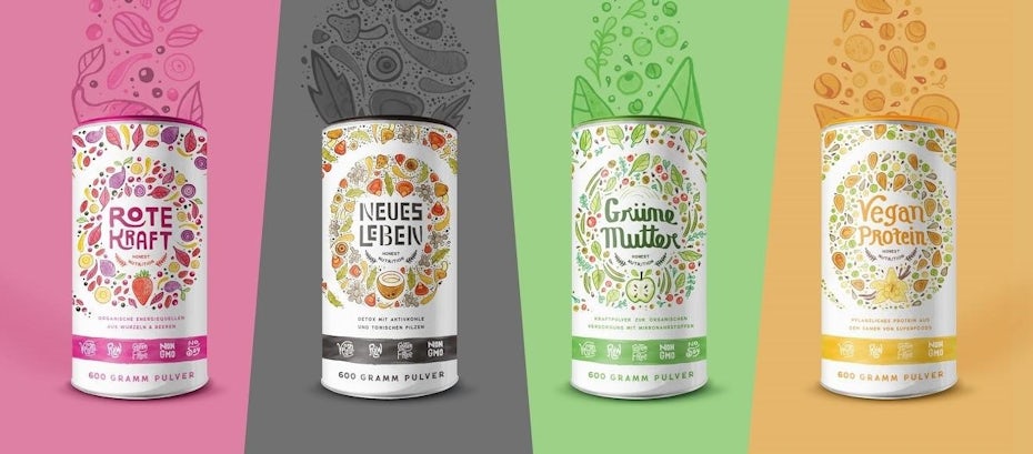
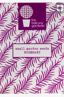
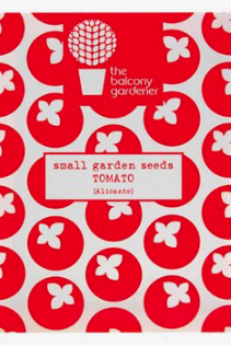
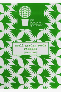
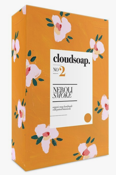
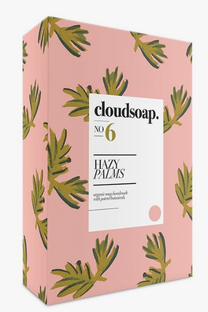
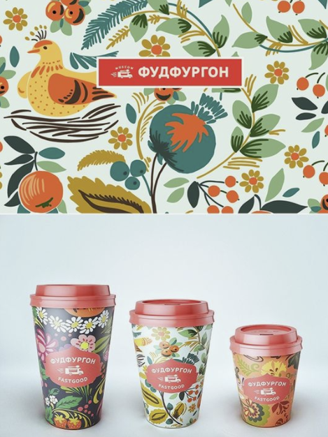
Using patterns in packaging design can be particularly helpful when you’re trying to visually differentiate different products, while at the same time maintaining a consistent connection to your brand. For instance, you can use the same pattern in different color schemes and variations to signify different flavours.
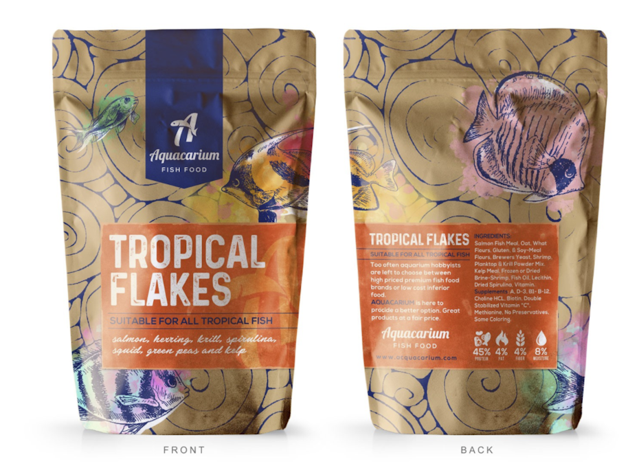
Another option would be to create patterns with a specific connection to each product. See how the fish feed packaging above uses a tropical fish pattern to reflect what’s inside? Other variations of this brand’s fish feed might feature illustrations of goldfish or carp, while using the same style to maintain brand coherence.
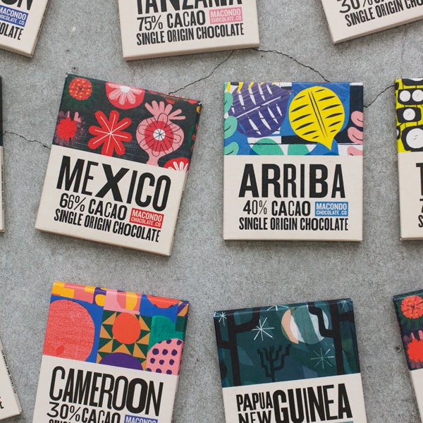
Additionally, patterns can help you stand out and highlight unique features. If your product comes from a certain region of the world, such as coffee or cacao beans, try incorporating a pattern that is unique to that region for an instantly recognizable feature.
Pattern colors
—
In most cases it’s a good idea to start with your brand colors when creating your pattern. But patterns offer you the chance to supplement your existing colors with additional shades.
When choosing the colors for your pattern it’s crucial to think about your target group or audience. Is it a youthful, fun-loving audience you’re trying to appeal to, go for fun and bright colors. Muted colors and pastels on the other hand create a harmonious, calming effect and would be a good choice for a more mature audience. If you’re going for modern and high-end, keep it simple color-wise and stick with a minimal, monochrome color selection.
Patterns are a fantastic way to play with colors and give your design a specific look and feel. Patterns work in synergy with the chosen colors, which can enhance their effect. A clean and simple pattern in pastel colors for example will feel much more calming than the same pattern in bright neon colors. Similarly, a black and white pattern can make a powerful statement. The contrast between two opposing colors allows your eyes to focus on nothing but the pattern, which gives it more impact.
The different types of patterns and how to use them
—
The different types of patterns depend on the structure in which elements are placed. Here’s how they are created and what effects they can have:
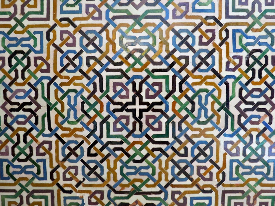
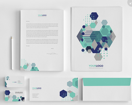
Geometric patterns
The easiest way to create a pattern is by placing graphic elements in a repetitive, evenly spaced pattern. That’s what we call a geometric pattern—referring to the geometric shape of the grid, not the symbols used in the pattern.
Imagine the composition of a geometric pattern like a grid. A symbol is placed on each intersection where the lines of the grid meet. The resulting effect depends on how and in what distance the next symbol is placed. Are the elements spaced evenly, the resulting pattern will look more organized. If the distances between grid intersections are irregular, the effect will be a little more messy. To add a bit more movement and interest, you can also rotate elements with each repetition.
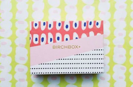
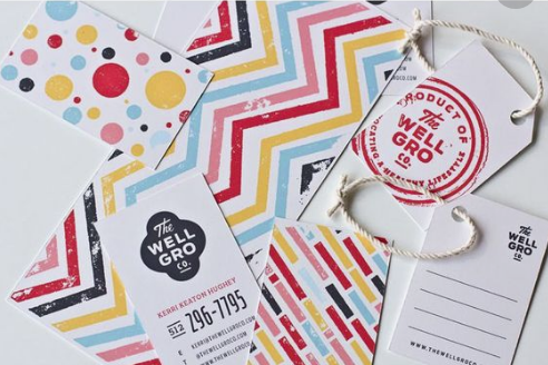
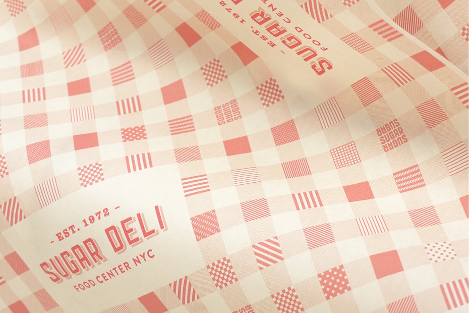
A similar type of classic geometric patterns are stripes, which are created by placing elements in lines or using elongated elements. If lines intersect, you’ll get a check pattern. If linear elements are placed diagonally or if they change directions, you can create a zig-zag pattern. There are endless variations of these types of geometric patterns and you can combine them in a multitude of ways.
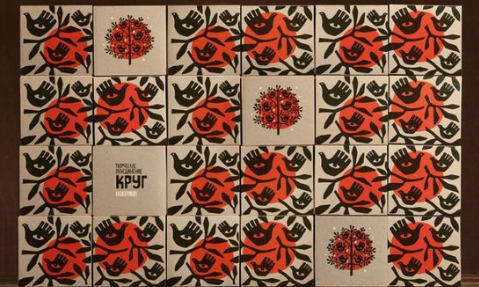
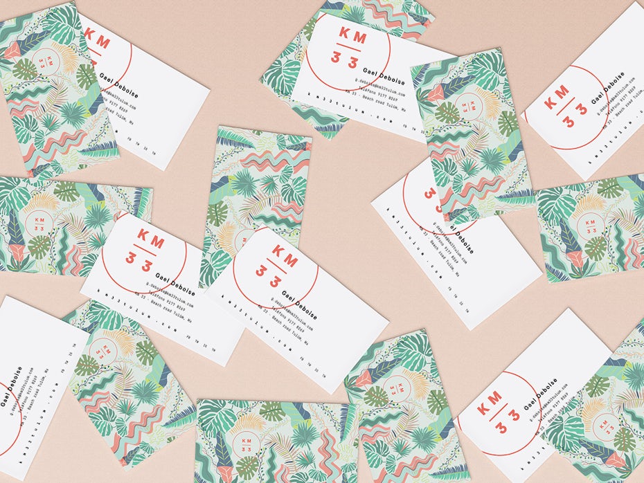
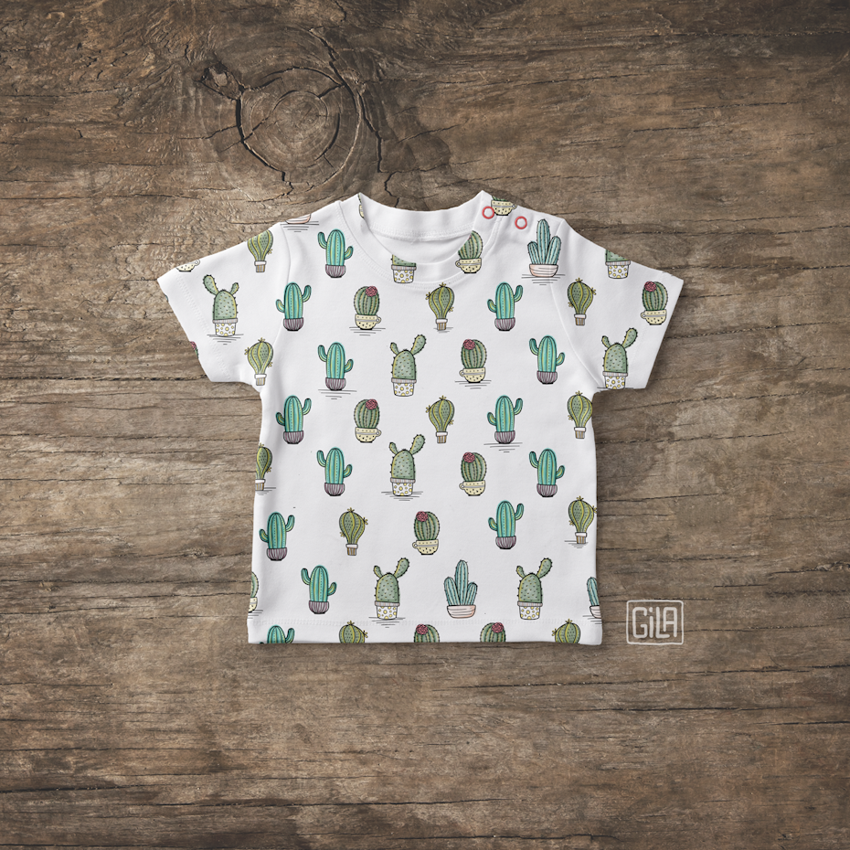
Allover patterns
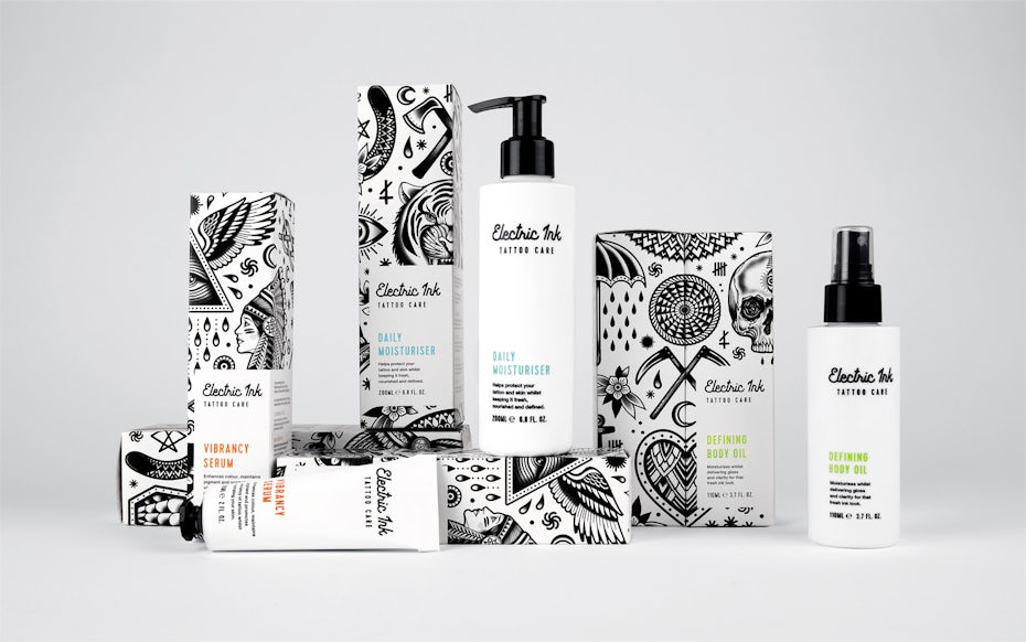
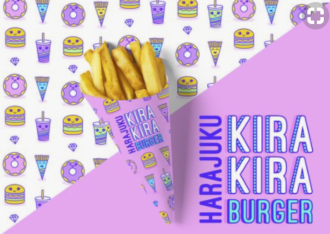
Some patterns incorporate various different symbols and the structure of their placement is not clearly visible. That’s what we call allover pattern compositions, the second main type of pattern.
Because allover patterns often have a more complex composition they add a lot of interest and can be really eye-catching. Although technically they should include a repetition to qualify as a complete pattern, in many cases they are only hinted at for lack of space—such as on packaging or in corporate designs. Usually, all you need is to create the impression of a pattern by filling a space with different symbols, so no need to adhere to any strict rules.
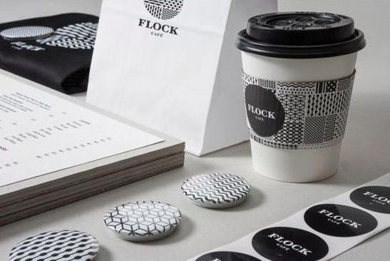
Allover patterns can be monochrome to draw attention to the graphics or colorful for a full-on look. The symbols used in allover patterns can be simple geometric shapes or complex drawings—in allover patterns anything is possible. That said, make sure that the pattern you choose works well with your brand style and creates a coherent look.
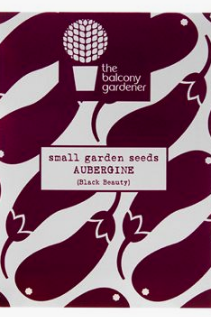
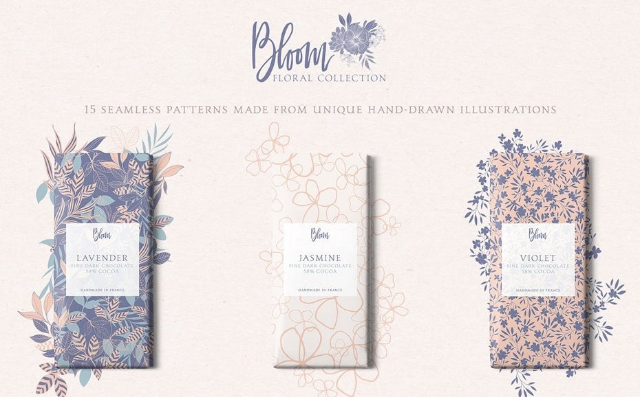
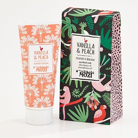
Floral patterns
A special variation of an allover composition are floral patterns. Floral symbols are clearly the most popular elements in pattern design.
Depending on color palette and style of the symbols the look and feel of the pattern can vary dramatically. A monochrome black and white floral pattern can look exotic yet cool and calm, while a colorful floral pattern is fun and loud. Pastel florals on the other hand are classic, chic and feminine.
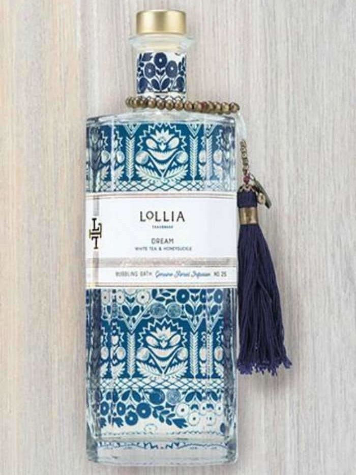
There are endless ways to draw floral symbols—whether they’re realistic, abstract, classic or modern—the sky’s the limit. Since floral patterns are deeply anchored in many cultures and have been around for thousands of years, they are a fantastic way to create a reference to a certain culture or time period and connect with people’s associations.
A particularly attractive trend, that has been prevalent recently, are vintage floral patterns. These patterns feel classic yet fresh and evoke fascinating associations to the styles of the 20s, 50s or 80s—or even striking new variations.
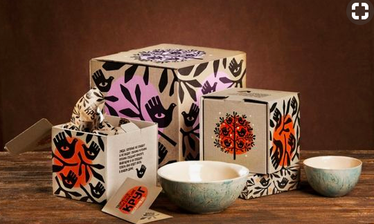
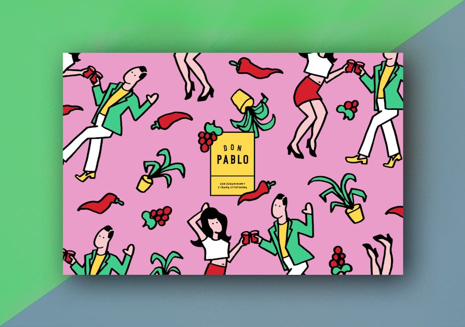
Communicative patterns
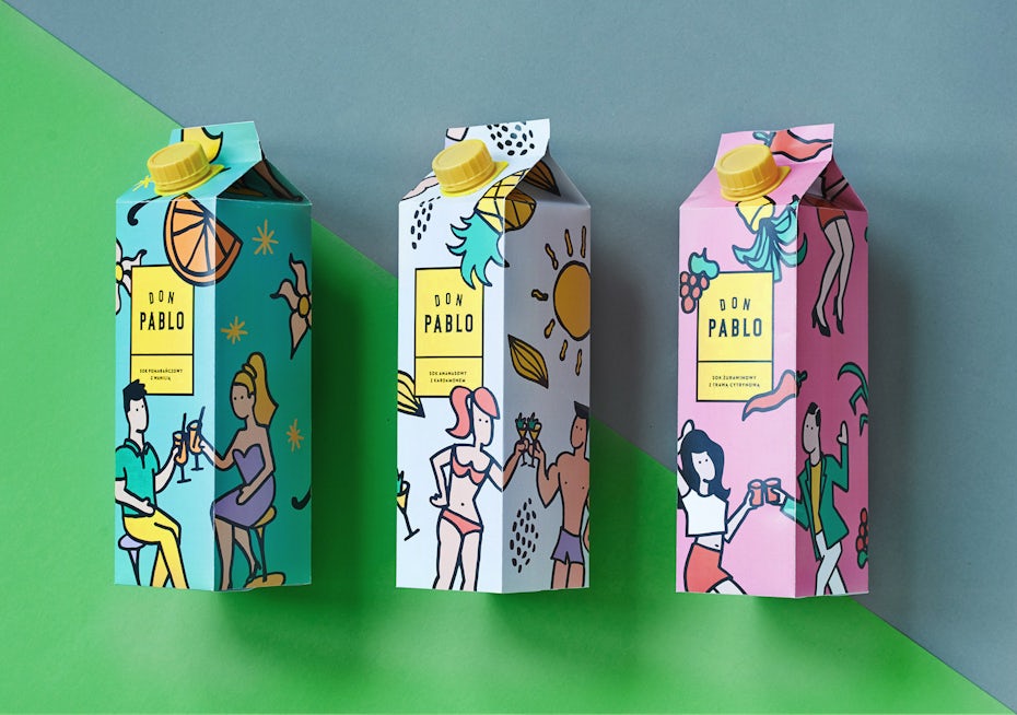
Whether you’re using a pattern for product packaging, business cards or web design—patterns are a wonderful way to create a connection to what your brand does. It can easily connect packaging with what’s inside and let your customers know what to expect.
If that’s what you want your pattern to achieve, communicative patterns are your best bet. These patterns can say a lot about your brand—and will make people talk about you for sure. They’re fun to look at and fun to create. Use them to give your brand a humorous twist, turn some heads or to connect the dots if what you do is abstract and hard to explain.

But communicative patterns don’t have to be loud and garish. They can work just as well in more laid-back, classic styles. Again, the rule is: anything goes, as long as it works for your brand. Think of symbols that represent your brand. All those things that communicate what you do can be shaped into a unique pattern that will catch your customers’ eyes.
Textural patterns

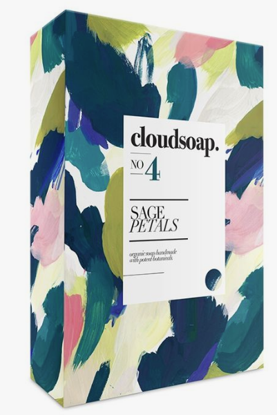
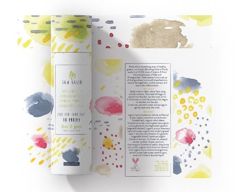
Sometimes a space is filled with a pattern-like composition of shapes that can’t be distinguished as separate symbols—a textural pattern. These textures are technically not ‘real’ patterns, but they have the same effect. They are perfect for creating interesting backgrounds.
Currently, a very popular textural effect for patterns is the watercolor effect. It creates a light-hearted, cheerful and youthful mood. Usually, pastels and bright colors are used for this. Depending on the shapes you create with watercolors, you can either use this effect as a consistent background texture or as an allover pattern.
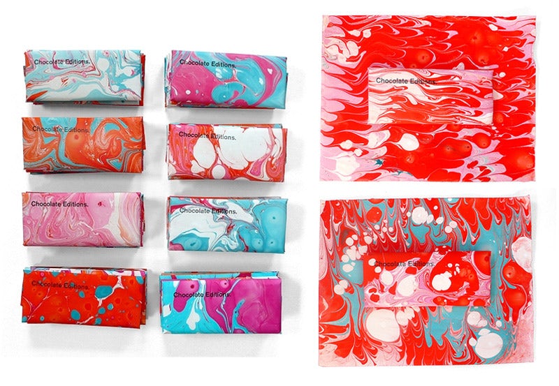
Especially the marble effect seems to be everywhere lately. These patterns can go from simple and calming to action-packed, depending on the strength and frequency of the swirls. This textural pattern can be created using monochrome colors for a classic yet striking effect, but combining more shades will give your design a really lively feel.
Combining different patterns
Once you’re hooked on patterns, you’ll probably want to use more of them for your brand, and the good news is: you don’t have to stick to one! You can mix and match them across your product range and brand materials and create a collection of patterns for your brand. There are no hard and fast rules, but make sure that your pattern combination looks harmonious across the board and matches your brand.
As a rule of thumb, know that there should be at least one element that links the patterns of your collection to each other—say monochrome line art or watercolor florals. It usually works very well to combine different patterns of the same type. Particularly suitable for this are geometric patterns. Another linking element can be your color selection. It doesn’t even have to be the exact same shade selection, even colors from a similar color spectrum, such as pastel shades, can go well together.
If you’re already using a flashy allover pattern for your brand and you want that pattern to get the full attention, then it’s a good idea to combine it with various simpler patterns. It is helpful to use the shades of the allover pattern as a starting point and pick a limited selection of these shades for the additional patterns.
Note: The size of the patterns you use plays an important role in the creation of your collection. Especially geometric patterns work well for combining different sizes of symbols, which create a different moods and effects.
The beauty of combining patterns is that you can extend your pattern “wardrobe” as needed with each additional product or landing page to give them a unique feel.
Everything’s better with a pattern
—
As you can see, the possibilities to use patterns are endless and no matter what you do, there’s a pattern out there for you. Just keep in mind who your customers are and what style you’re going for, so you can make sure that your pattern creates a coherent style for your brand.
Now comes the fun part: venture out into the intricate world of pattern design and start creating your own!
